
Sunday, 18 December 2011
Music Poster: Fifth Draft
Wednesday, 14 December 2011
To Do List:
Major updates needed this week:
ADD PHOTOS!! This is most important by a long while I need to finnish my products (In truth they are nearly done, finishing touches and pictures will sort that out.
Resend email to Beastie Boys record label.
If theres time redo story board.
ADD PHOTOS!! This is most important by a long while I need to finnish my products (In truth they are nearly done, finishing touches and pictures will sort that out.
Resend email to Beastie Boys record label.
If theres time redo story board.
Thursday, 8 December 2011
Music Poster Fourth Draft

Wednesday, 7 December 2011
CD Back: Fourth Draft

New CD Front: Third Draft

Tuesday, 6 December 2011
Font Update
The fonts shown eariler do not fit into my new design at all, therefore I have found a new, simple, clear and power font: Copperplate Gothic Bold
New Font Options

 My old font "Burtons Nightmare" was more of a decorative font for a more at the time decorative cover. Having consulted my peers I have decided to go for a much clearer and much more legible, I have found two very good fonts, "Canon" and "Heroes Assemble" to follow is my cd cover currently with the font replaced.
Monday, 5 December 2011
To Do list
Redraft Storyboard!!!!
Change CD Back colour scheme to fit in the with front
Change poster colour to add synergy to the set
Updates:
Update Clothing Posts with new photos and analysis
Update location post with location filmed video
Resend email to Beastie Boys record label
If there is time: redo lyric analysis
busy week...
Friday, 2 December 2011
Vimeo
Before making a judgment on a website, I first obivously look at the website to see what it is like, I can honestly say that Vimeo, while better than slideshare is still a useless and ridicuous website. Thus meaning that I will upload my video to Youtube rather than Vimeo. Useless Vimeo...
Wednesday, 30 November 2011
New Cd Front: Second Draft

Tuesday, 29 November 2011
CD Cover Option
 I had done this draft a while ago and well problems arose, I have found it again. I like this design. more than the other one, it actually looks different than the previous project. I will add the logo to see what occurs when that is added.
Sunday, 27 November 2011
Update:
Things appeared to be going wrong for the past two weeks but now, improvement has started. My filming has been done and a rough cut of the music video exists on a friends Apple Mac, the storyboard however has changed rather a lot so I will have to redo another storyboard.
To Do List:
Redo storyboard
Post rough cut of music video
Redo cd cover, cd back and poster
New First Draft

This is my brand new first draft from research I realised that rock album covers do not generally have people on the cover. They do however have a logo so in response I have redesigned my CD Cover, This will also mean I have to redesign my CD back and my poster again, or alter the colour scheme.
Thursday, 24 November 2011
Logo
Monday, 21 November 2011
Urgent
I have realised that project looks simply like a expansion of my last media project, I am going to have to change the colour scheme due to this being a different project, big opps on my part there. Filming is set to take place this weekend all being well, it is a busy week this week indeed.
Friday, 18 November 2011
CD Back: Third Draft

Wednesday, 16 November 2011
CD Cover: Fifth Draft

Monday, 14 November 2011
CD Cover: Fourth Draft

Wednesday, 9 November 2011
Music Poster: Third Draft

Tuesday, 8 November 2011
Cd Cover: Third Draft

Monday, 7 November 2011
CD Back: Second Draft

Thursday, 3 November 2011
CD Back: First Draft

Wednesday, 2 November 2011
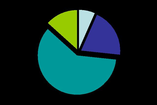
CD Back Layout: Results
Left Side: 4
Right Side: 10
As is clearly shown, having the track list on the right is what more of my peers believe is better for me. Here is what several of my peers thought.
Jazz: On the right you have a more room, plus you could put something faded behind it.
Mike: After looking through your research if you have it on the right, you can probably do something similar to the Paul Stanley back with a picture behind them.
Ryan: If you have the text on the right, it looks more like what would be on a metal album, unconventional.
Tuesday, 1 November 2011
CD Back: Layout Analysis
 These are my ideas for layouts, mainly the position of the track list on the back. With the track list on the left, I have space to work with on the right, however due to limitations I have had to sacrifice space on the right for the ability to read the text which I believe more important.
 This is the same text except to the right, it gives me slightly more room on the left hand side but I sacrifice the unity and evenness of the left sided back. This breaks conventions, usually the track list is on the left or in the centre, I didnt go for a centre since my tracks have very long names so I wouldnt have any room for any pictures to give character to the back of the cover.
 I will ask my peers, which one they believe to be the best for my product.
Thursday, 27 October 2011
CD Cover: Second Draft

Tuesday, 25 October 2011
CD Cover: First Draft

Friday, 21 October 2011
Music Poster: Second Draft

Thursday, 20 October 2011
Email to Capital Records

Wednesday, 19 October 2011
Analysis Of Clothes: Lee

Tuesday, 18 October 2011
Analysis Of Clothes: Michael

Monday, 17 October 2011
Analysis Of Clothes: Tom
 Being fashionable isnt my strong point but Tom is fairly fashionable, however my fashion skills will be tested in creating outfits for my team of actors. To begin with: Tom, the feature I want to get across most is the hoodys and how society excludes others and how others gang together, segregation one could say. Tom will always wear his hood up as will Lee.
Sunday, 16 October 2011
Analysis of Clothes: Lewis

Friday, 14 October 2011
Analysis of Actor: Lewis
 This is Lewis! This photo was not taken in 2008 as the photo says. He is quite tall, quite modern and the perfect figure to be the singer, he is 16 therefore the age of change effecting him greatly, the perfect person to sing the powerful lyrics to Sabotage.
Thursday, 13 October 2011
Analysis Of Actors: Lee Valentine

Video Making
Yesterday I worked with Jasmine on a project of making a short movie introduction with some play-dough, this will not directly effect my video and products it does give me an idea of how a film is starts and I will be albe to use this knowledge later on in the exam in June.
Wednesday, 12 October 2011
Analysis Of Actors: Tom Fryer

Tuesday, 11 October 2011
Location Analysis and Comparison
For my location I have chosen three locations that I may use for conducting my video shoot and weigh up the pros and cons of each one then decide which one is best to use for my video product.
 This image was one I used last year for my foundation portfolio, it is in the local Biddulph Grange. Which is free to enter and provides excellent natural lighting and an excellent ominous dark setting. I used the grange last year for my media therefore I would possibly worry about using the same place twice then again it is being resourceful and using what is practically on my doorstep. However it isn't good for the scene due to it being purely nature.
 This image is at Michael's house, Michael did not give consent for me to show pictures of his actual inside his house and gave this picture of someone in his garden. I would film outside to get the natural light which gives the best picture quality. His house is a typical 80's modern house with a brick wall which is excellent for filming the montage shots, he also lives in a cul-de-sac therefore has a slope and a gate for the bar scene. Highly considered.
 This image is in the village green area of Biddulph, It has a road and a small river & footpath, the road in particular would be useful in portraying a scene of anarchy, similar the area has a leisure facility which would also be good to use, since most youths are associated with hanging outside a leisure facility.
Analysis Of Actors: Michael Ellis

Monday, 10 October 2011
Lighting
Lighting is an important aspect to take into consideration when conducting my video making. As I will be filming my media in the day time outside the lighting I will use will be natural lighting which is the best option since its free and it brings out natural colours.
Schedule for W/C 10th October
This week intend to finish my planning, I will be visiting my locations, analysis the lighting, analysis my actors and their clothing/props.
Thursday, 6 October 2011
Poster and CD Comparison Analysis


These are Steel Panthers album "Feel The Steel" and Tour poster for the "Feel The Steel tour," As you can see they both use the same image which gives an excellent effect of synergy in the collection. I prefer the background on the poster, but the poster is more dynamic as it must be seen by more people.


KISS' Dynasty album uses the same image similar to Steel Panthers however with a simple two colour scheme which admitly looks weird but is clear and simple to read, I like the image, but then it only works due to KISS' make up.

This Five Finger Death Punch images use the same image just replicated to a different size, I like the idea that the colour scheme is exactly the same as each other, partiuclary of important is how the name of tour is in the same position of the album title.
From this research and comparison I have learnt that posters and their subsequent tour posts, tend to be nearly the same, therefore in my work I will attempt to keep the synergy in my work to a maximum.
Wednesday, 5 October 2011
Music Poster: First Draft

Tuesday, 4 October 2011
Monday, 3 October 2011
Further Notice
This week I plan to do a couple of mock up drafts for my CD Front, decide my bands name, and post my storyboard before Saturday.
Friday, 30 September 2011
Photoshop Editing Response
Jazz: I like the posterised and photocopy version of Tom although on the photocopy I would change the colour, the dry brush style doesn't look like you have edited it unless you look closely, the stand out bottom one is something you really are not good at, avoid and go for something different.
Mike: I like the second one, it looks modern and pop culture which is something that most rock bands are, you are breaking conventions with this style.
Lee: The first one looks unedited, the second and third ones looks excellent, I have to admit that the second one would obviously look awesome on a poster.
Leanne: Change the colour on the third one, and then use that one, it shows all the important detail, and importantly the eyes which are a key detail.
Thursday, 29 September 2011
Photoshop Editing
I have been editing an old photo on photo-shop to experiment with styles that I might be able to incorporate in to my product:


This is a photo of Tom in the dry brush technique style, I like how it makes makes the image more neat and tidier however it does have a big problem in that, it shows the light far more than normal and on the darkest setting Tom cannot be seen at all, which kinda defeats the object of having an image, it also to the untrained eye looks unedited.

This effect is called posters edge, I very much like this effect. It darkens and shows off Tom's eyes, It would make a good effect if I based the whole of my album front and back with a style like this. I would love to do a piece of work using a style like this.
 Other than this showing massive resemblance to Aha's "Take On Me" video I very much like the style of the outline similar to the poster one above, I would however have to change the colour from Orange to a better more suitable colour, although I have to admit the orange does look very good on its own.
 Clearly I would need a bit more practise and maybe several more lessons from my more photoshop savvy friends, but using this effect would make the picture look very similar to the Billy Idol album from the research, this might work with a specific album title but from my research rock and metal albums tend not to follow this unless it fits their style.


Wednesday, 28 September 2011
What I have been doing
I have been currently testing and trying to make some images from my last media project look more dynamic similar to my research. I have tried using Macromedia fireworks but it appears to be useless so I am going to try photo shop and experiment I will post my results on the blog.
Notice
I am now at the point where I have done lots of research and am ready to start filming my product, I have aranged with my actors to meet next Saturday to begin the shoot for the video, therefore before that I must draw a story board style thing to plan what my actors are going to do.
Tuesday, 27 September 2011
Target Market
For my video it is apparent that I will obviously be looking at targeting the type of people who are into metal and rock, but who are these people? That's a very good question and I'm now going to explore them in detail.

This guy here is what one would consider a normal rock and metal fan, similar to myself and my peers, minus the biker gloves, this guy would walking down the street be considered a normal person. Notice his clothing is predominantly black, nearly all rock and metal fans wear black a considerable amount (I am while I am writing this actually). He is probably a university or sixth form student of high intelligence and enjoys expanding his music taste. He will probably want to be either a high earning job and enjoy going to out with his mates regularly. This is roughly 1/6 of my target audience.

This girl (?) is an indication of what females who like Rock and Metal look like, Girls generally don't tend to like rock and metal music unless they choose to be very very different like this girl here, with her creative horns, mini dreadlocks, sharp pointed nails, vulgar spiro-graph style tattoos, neck brace/choker, Iron Maiden vest top and demonic expression make her the perfect example of a person I wouldn't want to be at a party with. She is probably been brought up in a family that has molded her into this form, usually types of people like her are found working in shops like Game Station, HMV and independent records shops, they might have to try and clean her up a bit first though. girls like her would also make up 1/6 of my target market.
 This strange fellow here will make up the rest of my target market, he is the type of person that doesn't regularly wash and will attend as many music gigs as possible and enjoy getting beaten around in most pits, he will probably also be a massive fan of the band he's going to see and know most of the words to their songs. He also will like black and probably wear it religiously and will enjoy experimentation with new material, which suits my music choice thoroughly because The Beastie Boys are a rather different style of music that don't suit even the most hardcore metal taste.

This guy here is what one would consider a normal rock and metal fan, similar to myself and my peers, minus the biker gloves, this guy would walking down the street be considered a normal person. Notice his clothing is predominantly black, nearly all rock and metal fans wear black a considerable amount (I am while I am writing this actually). He is probably a university or sixth form student of high intelligence and enjoys expanding his music taste. He will probably want to be either a high earning job and enjoy going to out with his mates regularly. This is roughly 1/6 of my target audience.

This girl (?) is an indication of what females who like Rock and Metal look like, Girls generally don't tend to like rock and metal music unless they choose to be very very different like this girl here, with her creative horns, mini dreadlocks, sharp pointed nails, vulgar spiro-graph style tattoos, neck brace/choker, Iron Maiden vest top and demonic expression make her the perfect example of a person I wouldn't want to be at a party with. She is probably been brought up in a family that has molded her into this form, usually types of people like her are found working in shops like Game Station, HMV and independent records shops, they might have to try and clean her up a bit first though. girls like her would also make up 1/6 of my target market.

Monday, 26 September 2011
Actors
I have consulted my peers and two have volunteered to be in my music video, Tom, Lee & Michael have agreed to be in my video films. I will meet up with them during the week to discuss what they will be doing in the video.
Sunday, 25 September 2011
Colour Scheme Poll

1


0

9

I asked my peers to vote on which colour scheme they would like to see on my work, knowing my project they voted the more upbeat style for rock and grunge. Heres what a couple had to say:
Leanne: I like the light green colour scheme it is more upbeat than all the others and it goes with your song
Charlotte: What were you thinking for the first scheme? I like the red, but I dont know if it will go with whichever is voted the best.
Ryan: I like the green, its bright and stands out, I also like the orange one at the bottom.
 Cyan = Number 1, Dark Blue Number 2, Azure Number 4, Lime Number 5
Subscribe to:
Comments (Atom)